


Whenever you test lines of code to apply a new or awkward techniques in web front-end, It would be good to use codepen.
row : wrapper for columns.
columns : There are 12 template columns available per row allowing you to create different combination of elements that span any number of columns.
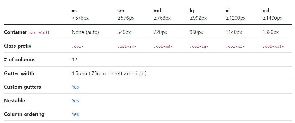
Bootstrap’s grid system can adapt across all six default breakpoints, and any breakpoints you customize. The six default grid tiers are as follows:
- Extra small (xs)
- Small (sm)
- Medium (md)
- Large (lg)
- Extra large (xl)
- Extra extra large (xxl)
Let's play with Grid!
You can see more information here
https://getbootstrap.com/docs/5.2/layout/grid/